
Landing page optimization is crucial for any successful online marketing campaign. A poorly optimized landing page can lead to low conversion rates, wasted ad spend, and missed opportunities. This article will guide you through proven strategies to transform your landing pages into high-converting machines, boosting your return on investment (ROI) and driving significant business growth. Learn how to effectively leverage landing page optimization techniques to capture leads, increase sales, and achieve your marketing objectives.
Whether you are running paid advertising campaigns, email marketing, or social media promotions, optimizing your landing pages is essential for maximizing your results. We’ll delve into the key elements of landing page optimization, including compelling headlines, persuasive copywriting, clear call-to-actions, and user-friendly design. By implementing these strategies, you can create landing pages that resonate with your target audience, driving conversions and achieving your business goals.
The Role of Landing Pages in Marketing
Landing pages play a critical role in online marketing campaigns. Unlike general website pages, landing pages are standalone web pages designed with a singular focus: converting visitors into leads or customers. They achieve this by providing targeted content related to a specific marketing campaign, offer, or advertisement. This focused approach eliminates distractions and guides visitors toward a desired action, whether it’s downloading a resource, signing up for a newsletter, or making a purchase.
The effectiveness of landing pages lies in their ability to improve conversion rates. By presenting relevant information and a clear call to action, landing pages streamline the user journey. This targeted approach leads to higher conversion rates compared to sending traffic to a general website page where visitors might get lost or distracted. Key elements of a successful landing page include a compelling headline, concise and persuasive copy, visually appealing design, a prominent call to action, and trust-building elements such as testimonials or security badges.
Ultimately, landing pages serve as a bridge between marketing efforts and desired outcomes. They connect advertising campaigns, social media posts, or email marketing blasts to a dedicated space where visitors can take the next step in the sales funnel. This targeted approach not only improves conversion rates but also provides valuable data on campaign performance, allowing marketers to optimize their strategies for better results. By tracking metrics like conversion rates, bounce rates, and time spent on page, marketers can refine their landing page content and design to maximize their effectiveness.
Elements of a High-Converting Page
A high-converting page effectively guides visitors towards a desired action, whether it’s making a purchase, signing up for a newsletter, or requesting a demo. Compelling headlines and clear value propositions are crucial for grabbing attention and immediately communicating the benefits offered. Users need to understand what they’ll gain by engaging with your page within seconds. This clarity is often achieved through concise and persuasive language, focusing on solving the visitor’s problems or fulfilling their needs. A strong call to action, using action-oriented language like “Get Started” or “Learn More,” provides a clear path for users to take the next step.
User experience (UX) plays a vital role in conversions. A clean, intuitive design with easy navigation is essential for keeping visitors engaged and guiding them towards the desired action. Minimize distractions and ensure the page loads quickly to avoid frustration and drop-offs. Mobile responsiveness is also critical, as a significant portion of web traffic comes from mobile devices. A seamless experience across all devices contributes to higher conversion rates.
Finally, continuous testing and optimization are essential for improving conversion rates. A/B testing different headlines, call-to-action buttons, and page layouts can reveal what resonates best with your target audience. Analyzing user behavior through tools like heatmaps and scroll tracking can provide valuable insights into how visitors interact with your page, identifying areas for improvement and maximizing conversion potential.
Crafting Strong Headlines and CTAs
Headlines are the first, and often only, impression you make on a potential reader. They must be compelling and concise, clearly communicating the value proposition of your content. A strong headline grabs attention, sparks curiosity, and entices the reader to learn more. Focus on using strong verbs and keywords relevant to your target audience. Consider incorporating numbers, questions, or a sense of urgency to further enhance their effectiveness.
Calls to action (CTAs) guide your audience towards the desired next step. Whether it’s signing up for a newsletter, downloading a resource, or making a purchase, your CTA should be clear, concise, and action-oriented. Use strong verbs like “Download Now,” “Learn More,” or “Get Started” to encourage immediate action. The placement and design of your CTA are also crucial; it should be easily visible and stand out from the surrounding content.
By crafting compelling headlines that grab attention and pairing them with effective CTAs that drive action, you can significantly improve your content’s performance and achieve your desired results.
Visual Hierarchy and UX Design
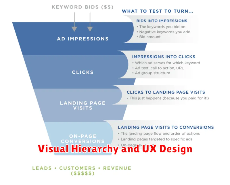
Visual hierarchy is the arrangement of elements in a design to guide the user’s eye and prioritize information. It uses visual cues like size, color, contrast, and spacing to signal importance. A well-defined visual hierarchy improves the user experience by making content easy to scan, understand, and navigate. It allows users to quickly find what they are looking for and complete their desired actions efficiently.
Creating effective visual hierarchy requires understanding user behavior and business goals. Designers must consider what information is most crucial and how to present it in a way that grabs the user’s attention first. Key elements of a strong visual hierarchy include a clear focal point, logical flow, and consistent styling. This ensures a cohesive and user-friendly interface.
By strategically implementing visual hierarchy principles, designers can dramatically improve the usability and overall effectiveness of a website or application. This leads to increased user engagement, higher conversion rates, and a more positive user experience. Ultimately, a well-executed visual hierarchy contributes significantly to a successful design.
Reducing Distractions and Clutter
Minimizing distractions and clutter is crucial for improving focus and productivity. A cluttered workspace can lead to a cluttered mind, making it difficult to concentrate on important tasks. Start by decluttering your physical environment. Remove unnecessary items from your desk, organize papers and files, and keep only essential items within reach. A clean and organized workspace promotes a sense of calm and allows you to focus more effectively.
Digital clutter can be just as detrimental as physical clutter. Minimize digital distractions by closing unnecessary tabs and applications on your computer. Turn off notifications for social media and email, or schedule specific times to check them. Consider using website blockers or productivity apps to limit your access to distracting websites. A streamlined digital environment can significantly improve your concentration and help you stay on task.
Creating routines and habits can also help reduce distractions. Establish a dedicated workspace and stick to it. Set specific times for work and breaks, and communicate your availability to others. Use noise-cancelling headphones or ambient noise to block out distractions. By implementing these strategies, you can create a more focused and productive environment for yourself.
Using Testimonials and Trust Signals
Testimonials and trust signals are crucial for building credibility and encouraging conversions. Testimonials provide social proof, demonstrating the positive experiences of past customers. They should be authentic and specific, highlighting the benefits of your product or service. Effective testimonials often include the customer’s name, title, and company (if applicable) to enhance their believability.
Trust signals, on the other hand, are visual cues that instill confidence in your brand. These can include security badges, industry certifications, money-back guarantees, contact information, and client logos. Displaying these signals prominently on your website can significantly reduce visitor anxiety and boost their trust in your business. By showcasing positive experiences and verifiable credentials, you establish a foundation of trust that encourages potential customers to engage and ultimately make a purchase.
Consider incorporating various types of testimonials such as quotes, video testimonials, and case studies to cater to different audience preferences. For trust signals, ensure they are up-to-date and relevant to your industry. A combination of authentic testimonials and strategically placed trust signals strengthens your brand reputation and fosters a sense of security, ultimately driving business growth.
Mobile Optimization Best Practices
Mobile optimization is crucial for reaching today’s users. A mobile-first approach in design and development prioritizes the mobile user experience. This includes considering smaller screen sizes, touch interactions, and slower network speeds from the outset. Testing on various devices and operating systems is essential to ensure a seamless experience for everyone.
Page speed is a critical factor in mobile optimization. Users expect fast loading times, and slow speeds can lead to higher bounce rates and lower conversions. Optimizing images, minimizing HTTP requests, and leveraging browser caching are key strategies for improving performance. Using a responsive design ensures your website adapts to different screen sizes automatically, providing an optimal viewing experience on any device.
Beyond technical aspects, consider the user experience. Streamline navigation, making it easy for users to find what they need with their thumbs. Clear calls to action are vital for conversions on mobile. Ensure your content is concise and easy to read on smaller screens. Regularly analyze your mobile analytics to identify areas for improvement and stay ahead of the curve.
Heatmaps and Scroll Tracking
Heatmaps and scroll tracking are powerful tools for understanding user behavior on websites. Heatmaps visually represent user interaction data, showing where users click, move their mouse, and how far they scroll down a page. This allows you to identify popular elements, areas of interest, and potential usability issues. For example, a concentration of clicks on a non-clickable element suggests confusion and a need for design improvement.
Scroll tracking complements heatmaps by providing insights into how users consume content. It reveals how far users scroll down a page, which sections receive the most attention, and where users tend to drop off. This data helps determine the effectiveness of content placement and identify areas that may require optimization to improve engagement and conversion rates. For instance, if users consistently drop off before reaching a call-to-action button, repositioning it higher on the page could be beneficial.
By combining heatmaps and scroll tracking, you gain a comprehensive understanding of user behavior, enabling data-driven decisions to optimize website design and content. These tools can be instrumental in improving user experience, increasing engagement, and ultimately achieving business goals.
A/B Testing Landing Pages
A/B testing is a crucial method for optimizing landing page performance. It involves creating two versions of a landing page (A and B) with a single differing element, such as a headline, call-to-action, or image. By randomly directing traffic to each version, you can measure which performs better based on a predetermined conversion goal, like form submissions or purchases. This data-driven approach eliminates guesswork and allows for informed decisions to improve conversion rates.
The key to effective A/B testing is to isolate variables. Only change one element at a time to accurately attribute performance differences. If you change multiple elements simultaneously, it becomes difficult to determine which specific change led to the improvement or decline. Properly conducted tests provide valuable insights into user behavior and preferences, enabling you to create highly effective landing pages.
Before launching an A/B test, establish clear goals and define the metrics you will use to measure success. Ensure your sample size is large enough to achieve statistically significant results. After a sufficient testing period, analyze the data and implement the winning variation. Continuous A/B testing is a best practice for ongoing optimization and adapting to evolving user needs.
Common Landing Page Mistakes
One of the most common mistakes is a lack of clear call to action. Visitors need to understand what you want them to do, whether it’s signing up for a newsletter, requesting a demo, or making a purchase. A vague or confusing call to action will lead to lost conversions. Ensure your call to action is prominent, uses action-oriented language, and is placed strategically on the page.
Another frequent mistake is poorly targeted messaging. Your landing page content must resonate with the specific audience you are trying to reach. Generic messaging that doesn’t address their pain points or offer a compelling solution will be ineffective. Focus on creating content that speaks directly to their needs and highlights the benefits of your product or service.
Finally, slow loading times can significantly impact your conversion rates. Visitors are impatient and will quickly abandon a page that takes too long to load. Optimize images, minimize HTTP requests, and leverage browser caching to ensure your landing page loads quickly and provides a smooth user experience.